Brand identity.
Built to belong together.

Logo, color, type and voice. A recognisable system,
grounded in your business and made for everyday use.

Discuss your identity

New identity, refresh or rebrand · Available as a standalone project

How much needs
to change?

Keep the recognition you have. Change what no longer fits.
The starting point shapes the scope.

New identity

Build the first coherent system.

For a new business or offer, or when you have outgrown a placeholder logo. Build visual and verbal elements around what the business stands for, starting with the assets, applications and templates you will use first.

Refresh

Keep recognition. Refine the details.

For a brand people already recognise, with a business direction that still fits. Keep the assets with value while improving consistency, small-size legibility, color pairings and type, and agree which touchpoints change first.

Rebrand

Make room for the next chapter.

For a material change in audience, offer or business direction. Revisit the foundations, decide what the identity needs to express and what still belongs, then agree any wider strategy work and a managed transition.

Start with what
you stand for.

Clarify the business. Then give the design a direction.
Focused positioning notes are the foundation; full brand strategy is a separate scope.

Who is it for?

The people you serve, what they value and where they will meet your brand.

What makes you different?

The offer and the qualities the identity needs to express. We review your materials and the way your category presents itself.

What should stay with people?

A few clear messages to carry through the way the brand looks and writes. Judge directions in relevant applications.

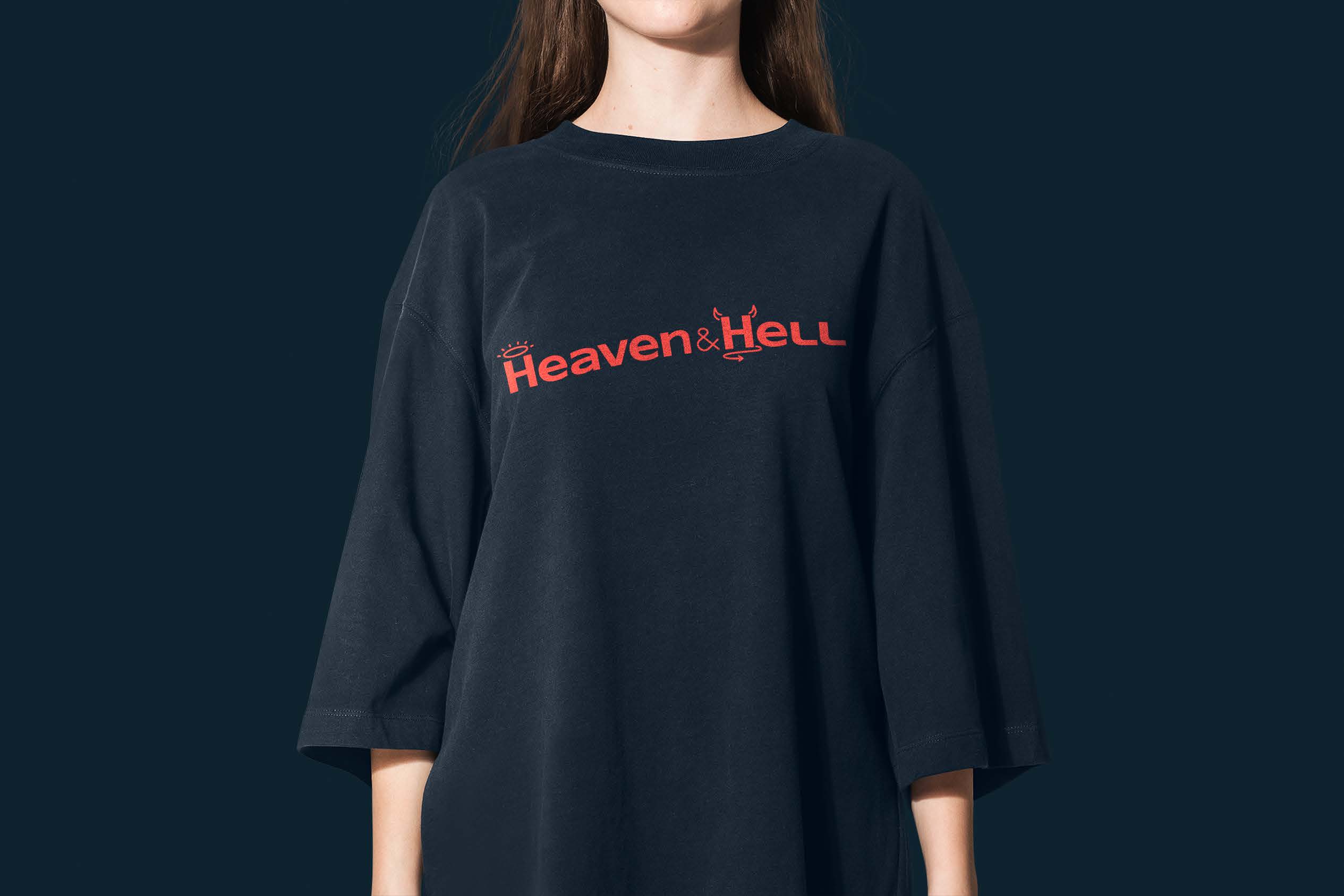
Heaven&Hell wordmark applied to a navy shirt, an original apparel application from the brandbook

Every piece
has a job.

Choose a direction in the places it will be used.
Then develop the parts into one coherent system.

Logo system

A primary logo and the variants you need: small-size versions, light and dark treatments, and an icon or favicon where relevant. Clear space, minimum sizes and usage examples make the system practical beyond its first presentation.

Color system

A palette with clear roles for primary colors, accents and backgrounds. We check contrast for specified text and background pairs at their intended sizes and contexts, and document combinations and any gradient rules so the palette is applied consistently.

Typography

A typeface selection and hierarchy for the screens and documents in scope. We check required weights, character coverage and readability in representative uses, then specify sizes, spacing and licence requirements so your team can work from the same rules.

Tone of voice

A focused set of writing principles, with examples for the touchpoints you agree with us: headlines, product text, emails or presentations. Guidance on language, tone and words to use or avoid helps different people sound like the same brand.

One identity.
From cup to screen.

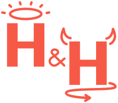
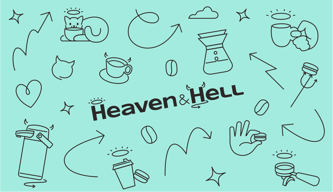
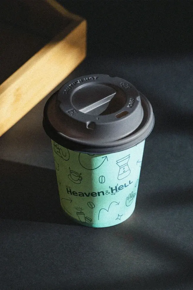
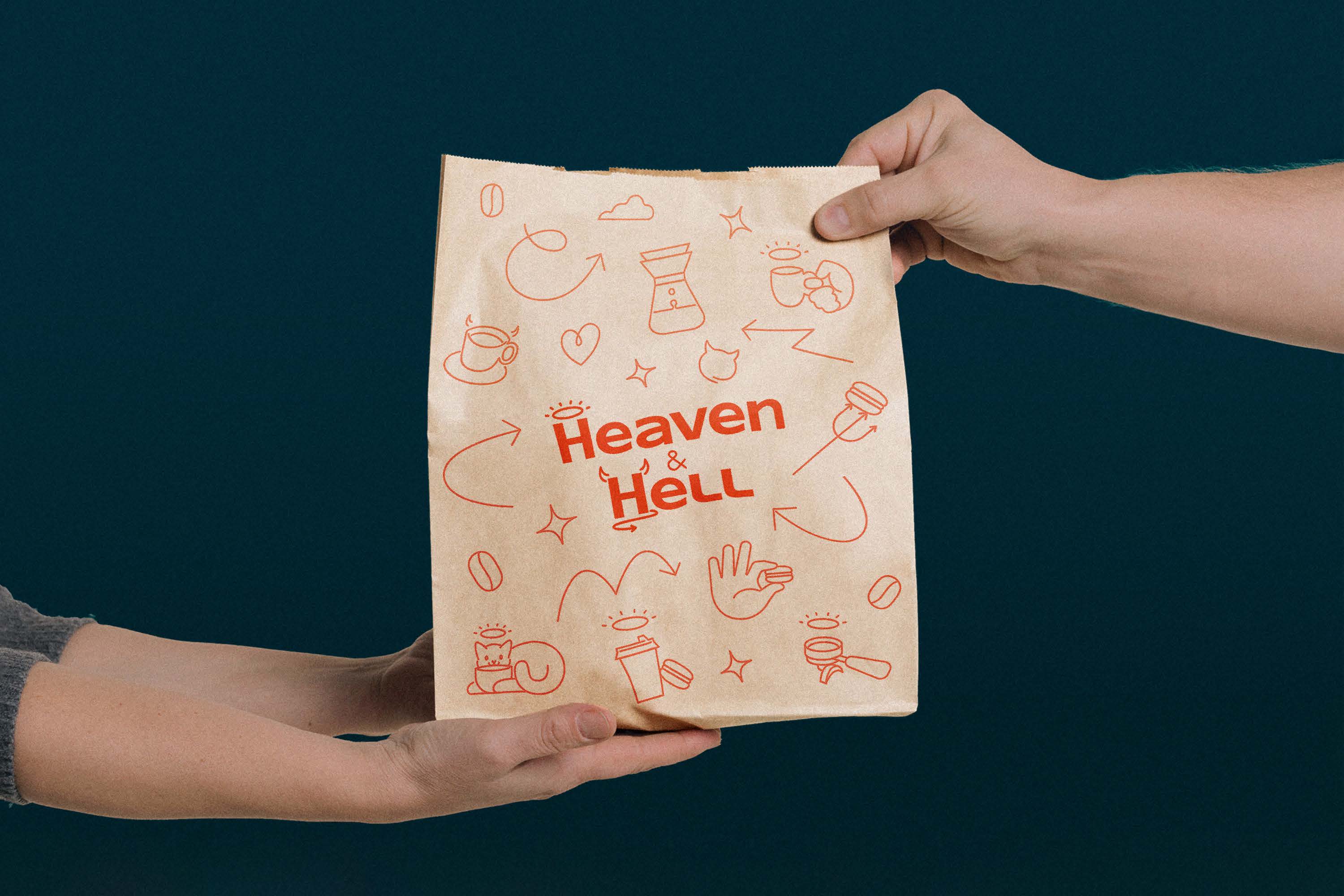
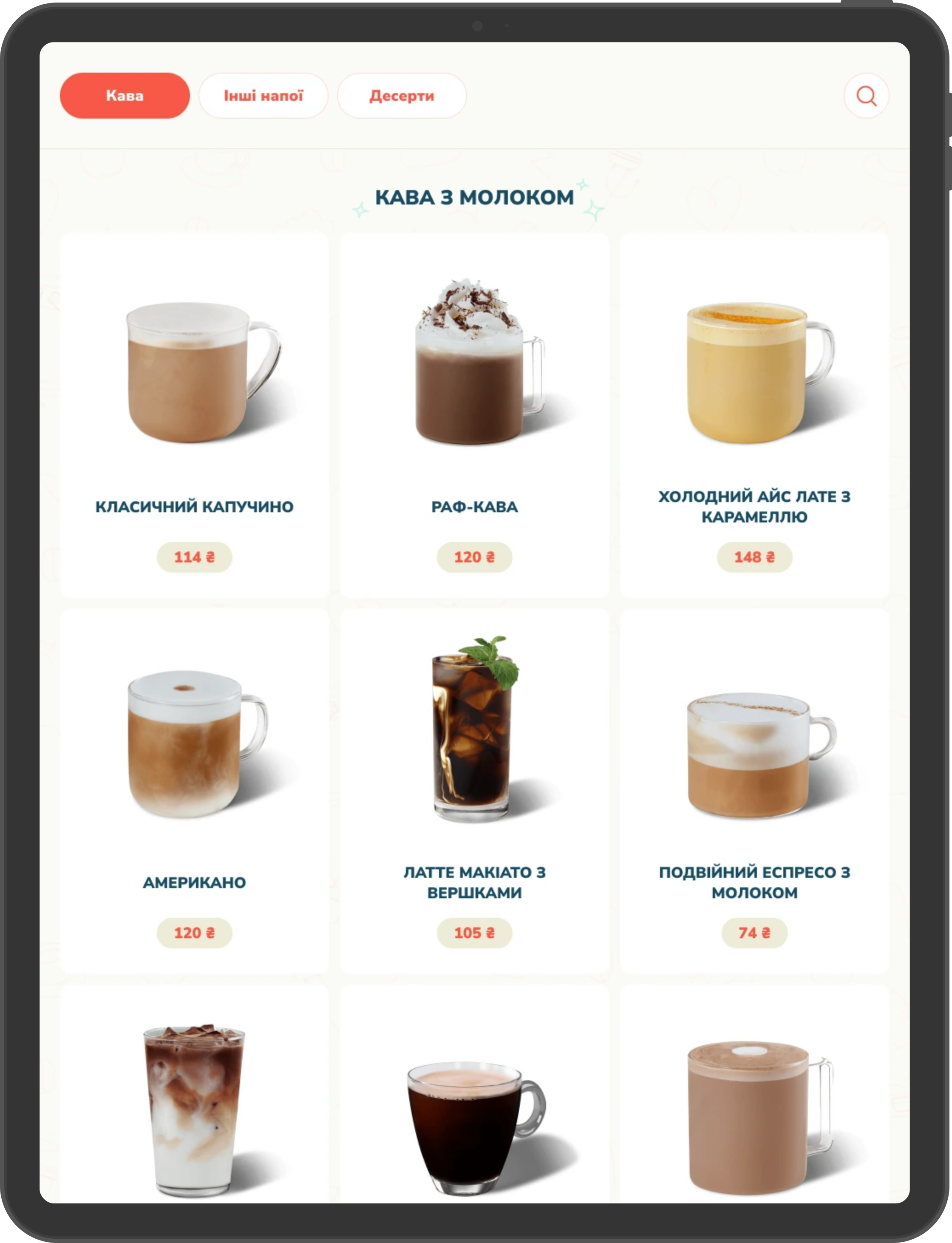
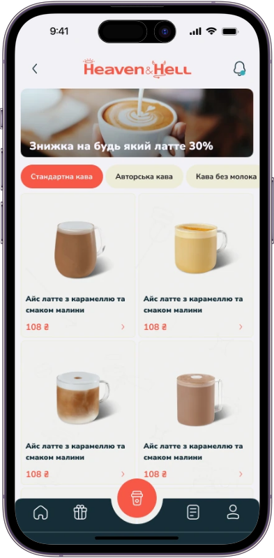
For Heaven&Hell, we created the visual identity and logobook.
The wordmark, monogram and coffee illustrations connect its different applications.

Original Heaven&Hell cream wordmark, sharp vector artwork from the logobook
Original Heaven&Hell halo-and-horns monogram
Original Heaven&Hell coffee illustration pattern
Logobook & identity
Ігор Нечитайленко (inechit)
App & kiosk UX/UI
Сергій Пазич (Pazych Sergey)

A distinctive visual vocabulary.

The original wordmark, halo-and-horns monogram and coffee illustrations work as a family. Color and character carry through the different applications.

Original vector artwork from the Heaven&Hell logobook.

See the full project

Character in the details.

Original sticker designs from the Heaven&Hell logobook.

Original Heaven&Hell sticker design 1Original Heaven&Hell sticker design 2Original Heaven&Hell sticker design 3Original Heaven&Hell sticker design 4Original Heaven&Hell sticker design 5Original Heaven&Hell sticker design 6Original Heaven&Hell sticker design 7Original Heaven&Hell sticker design 8Original Heaven&Hell sticker design 9

From a clear direction
to a usable system.

Five stages, with something concrete to review at each one.
Approve the decisions before we move to the next stage.

Understand the business

We review your offer, audience, current materials and category, then agree the ideas the identity needs to express. Focused positioning notes give the design a foundation; wider research or brand strategy is scoped separately.

You receive

  • Positioning notes
  • Materials review
  • Creative brief

We agree

The audience, offer, difference and key messages the identity needs to express, and the applications in scope.

A shared foundation for the identity.

Ready for the people
who use it next.

The handover is part of the identity project.
Agree the files, templates and team responsibilities at the start.

  • Logo suiteColor & type

    The identity files

    The agreed logo variants, vector and image exports, palette and typography specifications.

    Includes small-size, light and dark versions, icon/favicon assets and editable master files in the agreed formats.

  • Usage rulesEditable templates

    The guide & templates

    A practical guide to using the system, with the templates your team actually needs.

    Logo rules, color pairings, type hierarchy and agreed voice examples. Presentation, social or document templates are listed in the scope.

  • WalkthroughTransition plan

    A handoff to your team

    An organised source library, a walkthrough and a plan for bringing the identity into use.

    Where agreed: named design tokens, core component specifications and an implementation review. Delivery and usage rights follow the project agreement.

Start with the identity.
Take it further when needed.

Commission the identity on its own.
These are connected services, agreed separately.

  1. Website & product design

    Apply the identity to page layouts, user journeys and interface components. Agree these design projects separately.

  2. Development & rollout

    Build the site or product, prepare production materials and manage the switch. Agree the sequence, owners and release plan.

  3. Ongoing support

    Review implementation, create further templates or support the team as new needs appear. Define the work and cadence together.

Frequently Asked Questions

  • Yes. Brand identity can be a standalone project, with files, guidelines and agreed templates handed to your team or another partner. Website and product design, development, rollout and ongoing support are separately agreed scopes; you can commission only what you need.

  • A new identity establishes the first coherent system for a business or offer. A refresh keeps recognisable assets and improves what is dated, inconsistent or hard to use. A rebrand makes sense when a material change in audience, offer or direction means the current identity communicates the wrong story. We review your starting point before agreeing how much should change.

  • The identity needs a clear foundation. We review existing positioning and develop focused notes on your audience, offer, difference and key messages. A full brand strategy, extensive audience research or a wider portfolio strategy requires its own scope. We establish what is needed before visual exploration begins.

  • The starting point, positioning work, directions explored, logo variants, applications, templates and handoff requirements all affect the work. Reviews and decision-making on your side also affect the schedule. We agree the deliverables, review stages, price and timeline before starting; additional work is agreed before it proceeds.

  • You receive the agreed final files and editable sources: logo exports in vector and image formats, color and type specifications, guidelines, templates and any agreed digital specifications. Our agreement sets out ownership and usage rights for the commissioned work. Third-party fonts, photographs and other licensed assets retain their own licence terms; we identify the licences your team needs.

  • We consider the intended product context when developing the identity, including small-size marks, specified color pairs, typography and light or dark treatments. Named design tokens and core component specifications can be included where agreed. Designing the product's screens, flows and interaction states is a separate product design scope.

  • Yes. Identity and website design can run as connected, separately scoped stages. An existing site may instead need website redesign. Applied examples used to explore the identity do not by themselves include a complete website, its development or launch.

  • The identity handoff includes the agreed files, guidance and a walkthrough for your team. We can plan which touchpoints change first so the transition fits your business; every touchpoint does not have to switch at once. Rollout execution, an implementation review and ongoing design support are available as separately agreed work.

  • The scope described here covers identity design. Naming, trademark clearance, legal checks and registration are outside that scope. Registration and legal protection need advice from the appropriate specialist; identity design does not guarantee registrability.

Let’s build your next advantage

Tell us what you want to launch, improve or automate. Let’s discuss the scope and the next step.

Get in touch

Prefer email?

sales@cursopic.com

Cursopic

Tell us about your project

What would you like to launch, improve or automate? A few lines are enough to start.

We use what you send only to reply to you about your request. Privacy policy (opens in a new tab)

Prefer email?

sales@cursopic.com